Sankey Report
This is an experimental feature. That means we're still working on finishing it. There may be bugs, missing functionality or incomplete documentation, and we may decide to remove the feature in a future release. If you have any feedback, please comment on the dedicated feedback issue or post a message in the Discord.
What it is
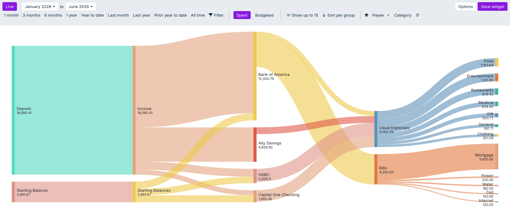
The Sankey Chart visualizes flows of money between buckets in your budget — for example, how income flows into accounts, how money is budgeted into categories, or how spending flows from accounts into categories. The chart emphasizes the relative sizes of flows and makes it easy to see major paths and where money is going.
The chart has two main view modes. Spent shows how income flows into accounts and how they are spent. Budgeted shows the money available to budget, and how it is allocated across categories.
Display options
- Date range: choose a fixed range or quick ranges (1 month, 3 months, year-to-date, etc.).
- Filters: apply filters (Account, Category, Payee, Tag, etc.). Active filters appear as editable chips and updates the chart live.
- View mode: view either spent or budgeted money.
- Number of nodes: select the maximum number of nodes to view per layer in the graph (or show up to all layers).
- Sorting: switch between sorting per category group, sorting globally or sorting by budget order.
- Layers: show a subset of the graph by selecting the start and end layers (from Income payee to Category in Spent view and Income category to Category in Budgeted view).
- Options:
- Switch between viewing percentages or absolute values
- Choose to group all accounts in the Spent view. This is useful if most of your spending happens from accounts without direct income i.e. if you spend from credit cards, but get your salary on a different account.
Important information
- A Sankey chart cannot directly represent negative numbers. In some cases, such as when funds are reallocated from categories with negative budgeting (e.g. using savings to cover overspending), the chart structure may differ from the main budget overview. As a result, some category totals and flows in this diagram may not exactly match the summary figures elsewhere in the app.
- The number of nodes shown in a layer will automatically be adjusted to fit the amount of vertical space on the screen, up to the "Show up to N" cap specified. Excess nodes will be put to an 'Other' node, starting with the smallest nodes. Hover the link to see a tooltip, detailing which nodes are grouped in an 'Other' node.
Known limitations
- Mobile and small-screen layouts may be limited; for the best experience use a desktop or tablet.
Quick troubleshooting
- No flows visible: verify the date range and filters include transactions and that accounts/categories are present.
- Small flows missing / grouped into "Other": the chart limits the number of visible nodes ("Show up to") and may aggregate smaller categories into an "Other" node. Increase the "Show up to" setting (or choose "All") or make the chart area taller to reveal more nodes; hover the "Other" link/node to see a tooltip breakdown of the aggregated items.
- Per-account details hidden when accounts are grouped: if the Group accounts in Spent view option is enabled the Sankey will collapse individual accounts into a single "Income/All accounts" node. Disable that option to see per‑account flows.
Related
- Reports index — other report types and tips.
- Transactions — inspect the underlying transactions for flows you see in the chart.
- Budget page — configure categories and rollover rules that affect how money is tracked.